
My mom-in-law was wanting to make some changes to freshen up her kitchen and asked for my assistance. She wasn't looking to do anything major so all that was needed was a bit of painting and styling of the bookshelves, counters and above the cabinets.
She took care of the painting (I just assisted with the color choice) and I handled the styling/decorating. I added a few new items, some purchased and some made, and reused items she already had around the house. The combination resulted in a brighter, more current kitchen design with very little money spent.
Keep in mind it wasn't a bad looking kitchen to begin with. It just needed a new set of eyes to help update it a bit. It's easy to get stuck with the "that goes there because it has always gone there" mentality in your own home. Get someone else in there to shake things up and you'll be surprised how different your stuff can look.
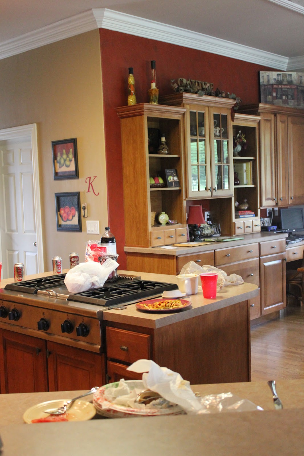
Here are some quick shots of the before. (Note: I didn't give her a chance to clean up before I took these photos.)


And here's our after results:


I probably should have taken a few more photos that gave a full view of the kitchen, but I was in a rush to take them all before my MIL got home. I'm sure you get the point. Every thing is a little brighter, a little less cluttered and just a bit more updated.
It was a fun project and I got to throw in a few of my photo plaques! Not only do they show off her lovely family, but they also pull the wall color down into the bookcase and break up the wood tones.


Here's what I was trying to achieve in this kitchen redo:
- Clear the clutter on the counters.
- If you don't need it and don't love it, toss it. I eliminated the unnecessary items and added some cute containers to house the "keeps".
- Simplify and freshen up the bookcase displays.
- I tried to keep the displays minimal so your eye can focus on just a few interesting things rather than getting lost in a large grouping.
- Brighten up the items in the bookcase with the glass doors so you can actually see the items inside.
- The original items were just in the cabinet for storage purposes and therefore didn't contribute much to the beauty of the kitchen. I added a few things to bring in more color (like the green bird) to help pull your eye over to that area as well. I also tried to make her existing patterned mugs more prominent by setting them closer to the doors, making them more visible.
- Add a bit more personality to the space with the items I chose to keep and eliminate some of the "dated" looking items. I did this in a few ways:
- My MIL loves her family, but had very few family photos in the kitchen (she has tons in the connecting living room) so I added a handful around the space to better represent her personality.
- I also chose to keep items that were a bit playful like the ceramic cow in the bookcase. There's really no need to be too serious. :)
- Finally, I tried to incorporate something that she likes throughout the room. I chose to use the birds since she already had quite a few pieces of art featuring birds. I just added a couple ceramic birds to the mix as well.
- Make the MIL happy. :) I think I succeeded.
The main tip here is to shop your house when you want to "redo" a room on the cheap. 90% or more of this was done using items already in her kitchen, in other rooms or in storage. Not bad.
Until next time...

And I must add, I do love it. Thanks for mentioning I didn't get to straighten up for the "before" pics, but actually it makes a good point. I did have stuff just strewn here and there (except the food and plates which were just left overs from lunch), and this was because I never felt like my kitchen was "finished" and I never liked whatever I did to decorate. But... Now I do and it's easier and I'm more inspired to keep it straight! So.... Thank you, thank you!
ReplyDeleteLooks great! :) I love the color!
ReplyDeleteI'm diggin it, sis! Gayle - house looks great! Loving the original art by Kee Creative that was added into the mix!
ReplyDeleteThanks Heather. I love it too!
Delete