Wednesday, May 25, 2011

"That's So Wrong" Wednesday Vol. 17


In the spirit of our upcoming beach trip, I would like to feature some terrible beachwear choices.  I promise we won't be sporting any of these outfits this weekend.

These all come from the Glamour's Nearly Naked DOs and DON'Ts list. Thank goodness we have them guiding our choices since obviously most of us would gravitate to these wardrobe selections.

The New Don’t: Unzipped Pants

Unzipped pants or shorts are apparently a no-no. Thanks for letting me know, Glamour.

Mesh, Thongs and Camo!

This look just confuses me. That camo doesn't seem to work for the beach.
Heels With <em>That</em>?
Who in their right mind wants to walk in heals on the beach? I mean really. Where are these ladies going?

We Don’t Wanna See That

And yeah, this really isn't necessary. Stick with the trunks, boys.

lab_image_fashion_bikini

And finally, I must include that obvious fake-n-bake signs is a definite beach fashion DON'T.

Thong bathing suits, too-small of a top and full mesh outfits are also on the no-no list, but those images made me a little uncomfortable. You get the idea.

Until next time...


Tuesday, May 24, 2011

1, 2, 3...Blast It!


This weekend my husband decided to tackle some household cleaning. Well, I say cleaning, but he "power-washed" which sounds much more manly. (But let's be honest...it's like cleaning the floors. It just so happens that the floors are outside. Either way it's still cleaning.)


It's a huge difference between the before and after that no one will notice but us. Ah, how nice. Oh well, it still feels good to have knocked something off our to-do list. And the most important thing about his "power-washing" is that it cleared all the dead cicadas off our front steps. They were everywhere and they freak me out. (Just ask Brent.) I mean, just look at these things.


So disgusting. I don't know if you have them at your house, but they are ALL OVER ours... everywhere. Actually, if they aren't all over your house, can I please come stay for four to six weeks?

Until next time...

Wednesday, May 18, 2011

"That's So Wrong" Wednesday Vol. 16


Good evening, kids.

Here's a collection of some of the most beautiful fireplaces ever. Feast your eyes on these babies...


ugly unique weird odd strange fireplace design stone Phoenix Arizona home house

stone fireplace designed by Frank Lloyd Wright Carefree Arizona home house

antlers taxidermy too large for room out of scale fireplace Mesa Arizona home ugly couch sofa

OK. That last one isn't really about the design of the fireplace, but come on...really? Thanks again to uglyhousephotos.com for posting some awesomely ugly design. 

Until next time...

Tuesday, May 17, 2011

Take a Seat


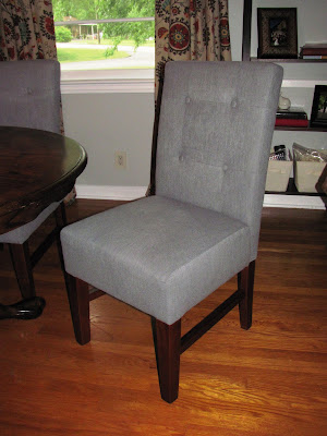
A couple weekends ago we decided to go ahead and purchase some new dining chairs. The ones we have been using up until this point are hand-me downs from my parents and they are broken with the cane seats sinking in. Friends always seemed to shrink as they sat in our chairs.

We plan to eventually purchase a new rectangular table and a bench from World Market as well so we can seat more people than our four main chairs. You can check out what I've got my eye on here. Of course, it can always change, but so far we are happy with our new chairs.


I think they look pretty darn good and they are super comfy which is a must when we have people hanging out for awhile. We also were able to snag them at a discounted price which always makes shopping more enjoyable. To make it even better, they were technically supposed to be full-price, but somebody accidentally left the previous sale tag on the floor model. Why is it that a discounted price seems much more exciting when it wasn't supposed to happen? It feels like such a victory! 

1 point Robin...although I'm pretty sure World Market is still wining this game.

Until next time...

Sunday, May 15, 2011

Inspired: Ana White Homemaker


I love making lists and seeing as we live in an older home that was decorated quite differently than my own tastes, I have a list about a mile long of projects/changes that I would like to accomplish. (Sooner rather than later, please.) Many of the items are just simple "honey-do" items like mounting the TV on the wall which my dear husband is doing as I sit here blogging...please don't judge me...while others are painting projects, art projects and even major demolition plans. Needless to say there is plenty that I want to get done, but thanks to my dear husband, I now have my head spinning with more project ideas that I can stand.

This afternoon, Brent decided it was time to introduce me to Ana White. Her website/blog has a massive amount of followers so I'm sure some of you may have already come across it, but somehow I had not until today. Let me just tell you, I want to be her I am in awe of this self-proclaimed homemaker. Not only did she and her husband literally build their home with their own hands, but her website gives you step by step construction details on how to make your own furniture pieces. Oh, the projects I plan to do!


Check out her website when you get a chance. (Click the image above.) You'll be bombarded with ideas and inspiration. 

Now off to make my new list of home to-do's... 1. Reclaimed-wood Headboard, 2. Ten Dollar Ledges, 3. Farmhouse Bedside Tables, 4. Vintage Crate Carts...

Until next time...

Friday, May 13, 2011

Love it! Wall Decor


A couple weekends ago we finally got some wall art up above our sofa in the living room. It's the main wall in our living room so it was really begging for some attention. We (and by we I mean I) decided to go with some family photos as our focus since, after all, it is a space for family to gather.  

It all started with four frames I picked up at Hobby Lobby during their 50% off framing sale along with some precut mats. Then I shuffled through some wedding photos and some old school pictures I had stored away from our wedding rehearsal slideshow and decided on four photos that I just loved. 


Then I added in two skeleton keys I had left over from this earlier living room art project and a wooden "K" initial. We really didn't love the "K" right away. It was too white and perfect looking which did NOT work with the vibe of the frames so I sanded it down a bit. Then I sanded it down some more until we finally decided it could stay.

With everything combined, this was the result.


Good, but not quite enough for my taste. I knew I would want to add some more to the collection and I had an idea of what I wanted, but it wasn't something I had actually seen. I had that, "I'll know it when I see it" idea. And now I've seen it. 

I now introduce to you my "Love it! Wall Decor", Shanna Murray's Illustrated Decals. They are spectacular and I'm going to have to try to keep myself from buying one for every room in the house.

Here are the two that I'm already planning on snatching up to add to our living room wall:

1. This baby will be going around the "K". I'm thinking in the gold rather than the white.

2. This gem is my fav! It actually has a chalkboard center so I can put any quote that speaks to my heart. I'm planning on using this one from the Avett Brothers... "Always remember, there is nothing worth sharing like the love that let us share our name."

Don't you just love these? I'll be sure to post pictures once I've put these babies on the wall. I'm super pumped!

Until next time...

Wednesday, May 11, 2011

"That's so Wrong" Wednesday Vol. 15

Every so often, I pull up to my computer, open up a Google search and as I hit enter, I cross my fingers and hold my breath that there is someone out there with enough time to dedicate hours upon hours of research to my random topic search. Today I had success. 

This morning I woke up with a dream. A dream to find a handful of images of awful cake designs. (Well, maybe just an idea, but "a dream" sounds much more passionate.) Just moments into my search what did I find? A whole website dedicated to my random topic search. Enter, cakewrecks.blogspot.com

Here are just a few of the images that grabbed my attention, but I highly recommend that you cruise by this blog and enjoy the beautiful disasters. You'll be sure to waste hours of your day.

These are from their "What is This?" section:


These are from their Mother's Day section:


And here's one of my personal favorites:


Who doesn't want sprinkles?

Until next time...

Sunday, May 8, 2011

A Few of My Favorite Things

When you buy a [previously owned] home you inherit a few items here and there around the house. These are my favorite, left-behind items. Some of these items are just lovely or interesting and you'll easily understand my love for them.

Love! These flowers are HUGE and are at the corner of our house. They are beautiful and basically make up for all the weeds in our flowerbeds. 


Love! This note on our driveway. Right outside our back door we have a reminder of the history of our home. It states, "Built by Ford Gang 4-22-70". How awesome! And I think it's pretty funny they called themselves a "gang". 


Love! Well, my husband loves it. This is visible right outside our bedroom window which is super convenient when trying decide what to wear in the morning. Who needs a weather man?


Others are simply head-scratchers.

Hmm? A ceiling fan in the carport? OK. I think I can jump on that bandwagon, but a ceiling fan with a green light? I don't know. (Oh, and yes, that is a basketball at the end of the light chain.)


Hmm? Tiny antlers above the storage shed door? Of course. Those are totally needed, right?


Is there anything you've come across in your home that you've fallen in love with or that you've just decided to embrace? I personally think it's part of the fun of owning an old home.

Until next time...

Wednesday, May 4, 2011

"That's so Wrong" Wednesday Vol. 14

This beauty comes from my new favorite website which has the world's ugliest couch contest. It is amazing. My husband introduced me to this website and I'm pretty sure I love him more because of it.

CLICK TO VOTE
http://www.norwoodmall.com/ugly/
Praise the Lord for bad design. 

Now, who exactly do you think would buy this couch? It's a perfect mix between grandma floral and retro diner. I'm not sure who would be going for both of those looks in one item, but they would be thrilled with this sofa.

Until next time...

Monday, May 2, 2011

The Difference Between a Boy & a Girl

No, this isn't a talk about the birds and the bees. Calm down.

Last weekend I discovered three gift cards in my husband's car console. He had two to Lowe's and one to Home Depot. Naturally, I asked him, "Have these been used?" He naturally answered, "I don't know." Geez.

Come to find out, we had $50 to Home Depot and $48 to Lowe's left on these gift cards that he had hiding in his vehicle. Where did they come from? Our wedding shower. Our wedding shower that occurred in 2008. How the crap does that happen? I mean, really.

The positive side of this irresponsible behavior is that it was like having free money appear out of nowhere. So naturally, I got to decide what it was spent on. Nice. 

I decided on a new light fixture for our bedroom. Here's what we were working with before hand. Not OK.


Here's what we have now thanks to my hubby's mad electrical skills. (Well, he developed his mad skills.) Love!


Once the light was in place, we stood back to observe our handy work. (Like how I threw "we" in there?) My response was, "Look how romantic it is!" My husband's response? "How is that more romantic?" Geez.

Until next time...