Hey Hey, KeeCreatives!
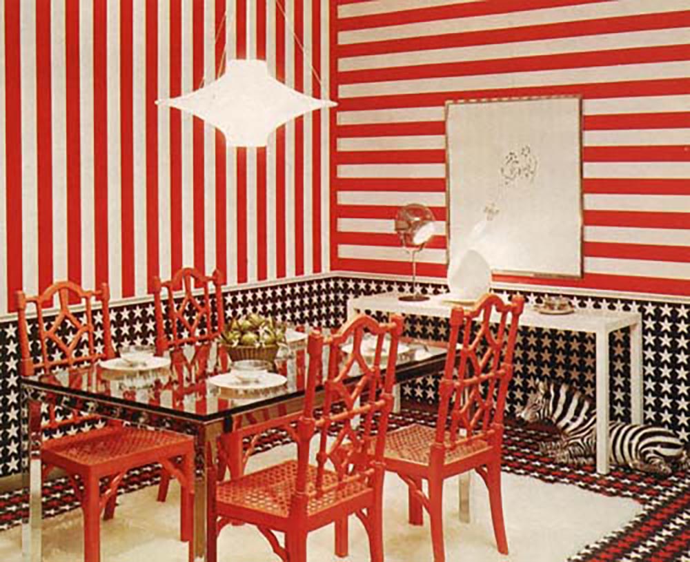
The 70's seem to be great at providing us with wonderfully bad design images which I am very thankful for. This week I bring to you a very patriotic room design from the 70's.
 |
| This image I snagged from http://designblocks.wordpress.com/2010/10/21/retro-fun/ and it originally came from Ugly Rooms for Beautiful People by James Lileks |
I'm all for a pro USA design, but I have to question how the zebra fits into that theme. It's almost like a "Where's Waldo". Maybe "Spot the Zebra"? That could be fun.
I will say I would take those chairs in a heart beat. LOVE...just maybe not in red.
What do you guys think? Are you patriotic enough for this room?
Until next time...

my eyes burn just looking at it. yikes
ReplyDeleteI like it too.
ReplyDeleteYou would like it, Frank. You would.
ReplyDeleteDo u think the floor is wallpapered and I wonder what the ceiling looks like? Talk about dizzy !
ReplyDeleteOh, I really hope the ceiling has stars too.
ReplyDelete